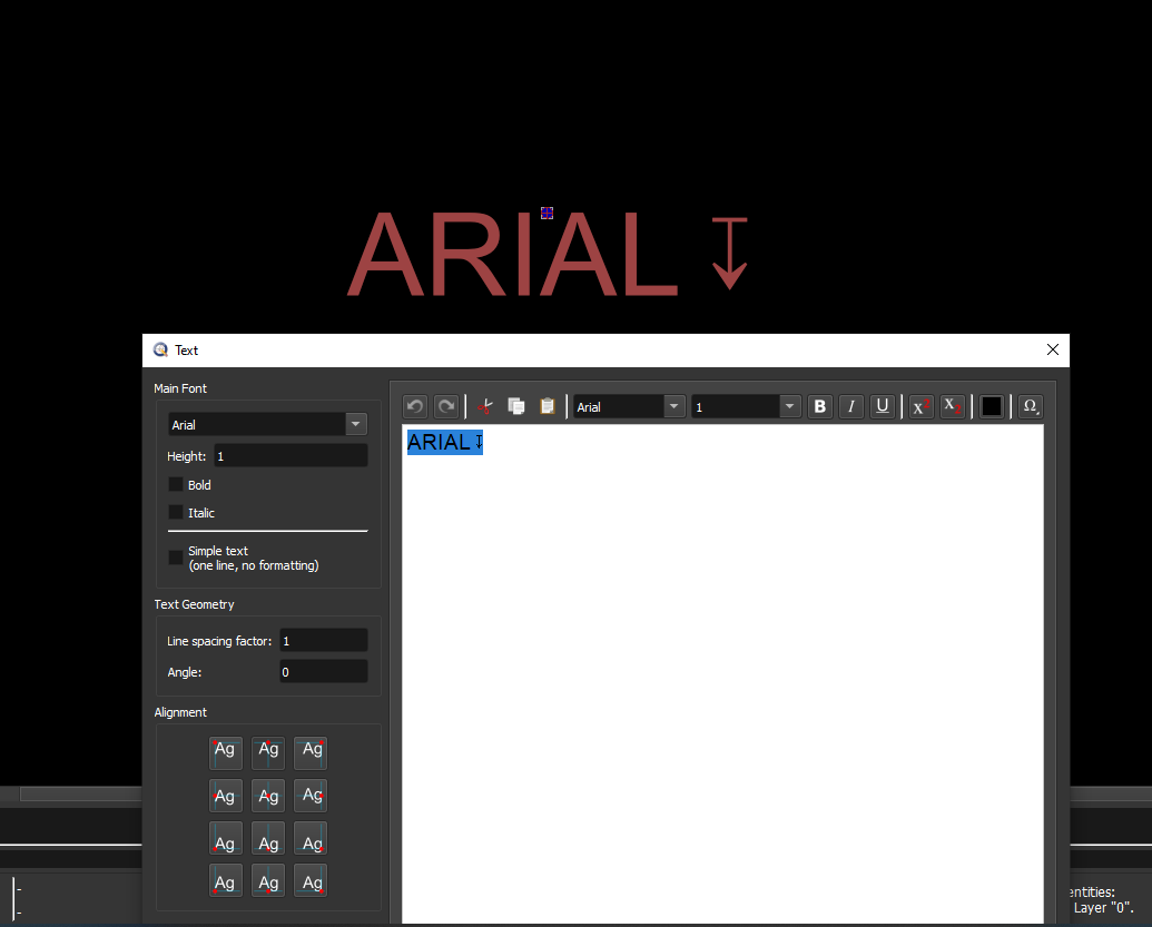
Hi, I’m trying to insert a “depth of plunge” symbol into a text block on Win10/QCAD 3.27.6.
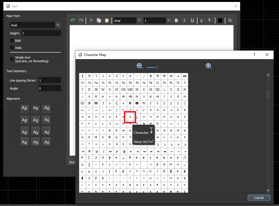
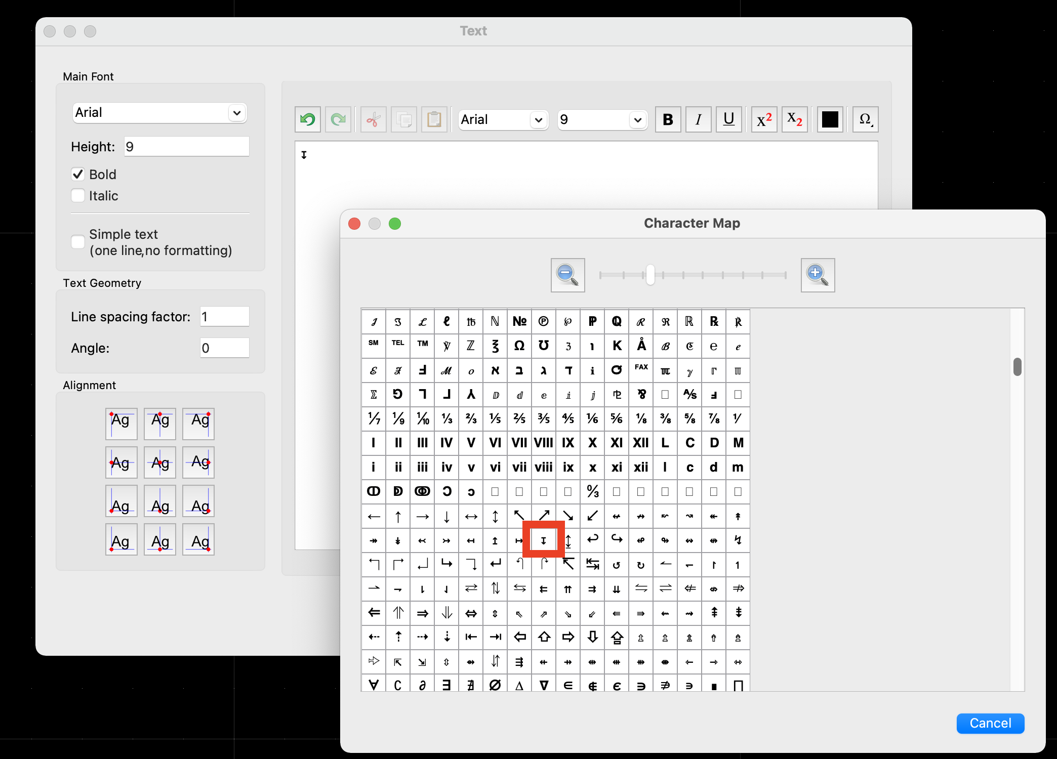
According to ↧ Downwards Arrow from Bar (U+21A7) Symbol Meaning, Copy and Paste, the symbol I’m looking for is U+21A7 or thereabouts. So I found it in text properties - special characters - others, but this only displays as a “?” symbol. I’ve tried changing the text font several times, including Unicode, to no avail. Is there an alternative or work-around for this symbol in QCAD?
I am able to use U+2193 (a downwards-pointing arrow) but it would be nice to use the actual symbol. Thanks!
What fonts have you tried? If you use the “standard” font that is the default built-in CXF font that comes with QCAD, it seems to work fine. EDIT: I messed around a bit more and now I am getting a question mark using the “standard” font. Sometimes it can be tricky in the text editor window because there are two places you can specify the font and you can think you changed it but you really didn’t.
I also tried it on a half-dozen true type fonts installed on my Win10 system, and they all had this particular glyph as well. For instance, it seems to work using “Arial” font.
The glyph for ‘Downwards Arrow from Bar’ doesn’t exist in the CXF font called ‘Standard’.
Even better, it doesn’t pop up in my Windows Character Map for the Arial font.
I could copy the symbol from the mentioned link and insert that in a QCAD text using Arial.
Then all depends if the used font has the glyph included.
If you really need it as ‘Standard’ then one could edit the CXF font file.
One could share the edited ‘Standard’ font so that Andrew may update it …
Why not? It is only a question of the right font. There are already hundreds of fonts out there which include that symbol U+21A7. And if you are hooked to “Standard” I just modified the QCAD cxf regarding your missing symbol.
Standard.cxf (24.6 KB)
Did I mention that I don’t like the QCAD Standard font …
However - if you have to use that symbol or similar symbols on a daily base then I would recommend to think about a better solution for that task. You are on Windows what means there are a few option out there …
Yes - I would second that. And it looks to me that the Text Editor is using a different font for the preview. But that is only a wild guess …
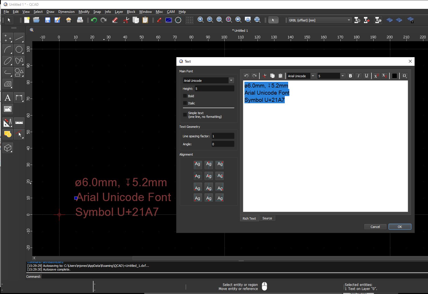
Try “Arial Unicode MS” instead of Arial. That should work. Looks already better than Standard.cxf …
I am a little confused… I also do not see the plunge symbol when I look through the arial font on the Windows Character Map. So what am I seeing here in QCAD?
Can you elaborate on this, Andrew? Is Windows causing the substitution within the QCAD text editor? Are you saying that’s why I can see the plunge character even when supposedly in the Arial font?
I’m not a Windows expert but that’s how it looks like to me. Try the same thing in Notepad, Wordpad, etc. the glyph will show up even if you are using Arial. It’s unrelated to QCAD.
To be precise, it’s the OS that renders the glyph “↑” in font “Arial” onto your screen when the character map is shown, or when you type that glyph into the text dialog or when QCAD renders it as part of a text entity in the graphics view.
The font name at top of the editor did have to be set to “Arial Unicode” several times - it kept reverting to it’s default (Cyrillic_ll.) Not sure why it refused and made me pick several times. It’s also a little unclear if the left font selector is only for the rendered text (and the right font selector for only the editor text?) But if it were possible to merge both of these font selectors into one control, or default link them, that might be simpler and easier to use. Because I was seeing the problematic symbol just fine in the editor, but not on the rendered page - if the editor and rendered text used the same font, then I’d have seen the issue in the editor and known to change the font immediately.
Unicode is a complicated mess; there’s an entire consortium just to oversee it. And it’s always a moving target - symbols are updated occasionally, so it’s not surprising that different fonts / languages / operating systems still handle it slightly differently.
The font selector at the left is the “main font” or “initial font” of your text. If your entire text entity only uses one single font, only use that.
The font selector at the top (and the other formatting controls at the top) apply only to the current selection. To use this, select first the part of the text that you want to be different than the main font and then change the font using this selector.
If your text entity only has one line and only uses a single font and uniform formatting, switch to “Simple text” at the left. The formatting options at the top will disappear, making the text tool easier to use for such texts.
 There are already hundreds of fonts out there which include that symbol U+21A7. And if you are hooked to “Standard” I just modified the QCAD cxf regarding your missing symbol.